Today, data visualization has become a significant part of our lives. It aids in making sense of vast amounts of data, revealing insights that might go unnoticed in text-based data. Charts are one of the common methods used to visualize data, and among these, radar charts occupy a distinct place. But what are radar charts, and what are their uses? Keep reading to learn more.
The Essentials of Radar Charts
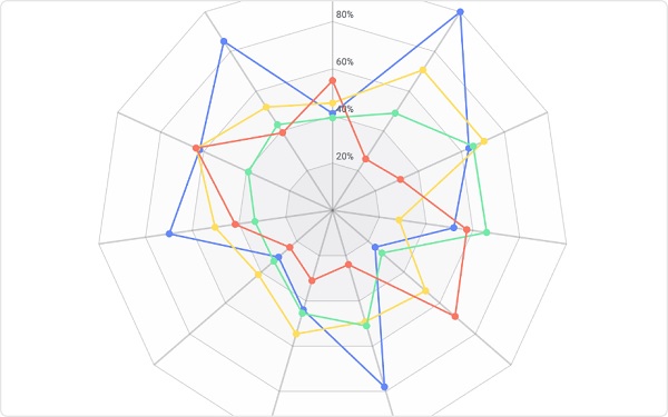
Radar charts, also known as spider charts due to their appearance, represent multiple data variables on different axes starting from the same origin point, thereby forming a ‘net-like’ structure. They’re predominantly used for depicting a performance metric, comparison, or statistical information. These charts provide a comprehensive view to compare multiple parameters simultaneously in one chart, making it incredibly useful in several fields.
Visualizing data using radar charts offers a unique advantage as it presents multidimensional data in a two-dimensional view, thereby preserving the correlations existing between the variables. Radar charts are ideal for visually comparing the properties of different items across multiple factors and highlighting their strengths and weaknesses. They’re also beneficial when it comes to analyzing the performance of an item over time.
The axes of a radar chart are arranged radially, with each representing a variable. The data points are then plotted on each axis and connected with a line to form a polygon. If the chart contains multiple polygons, it can clearly indicate similarities and disparities, thereby making it easier to detect patterns or trends. This ability to represent multiple dimensions simultaneously has made radar charts popular in various fields like market research, sports, data analysis, and project management.
The Versatility of Radar Charts
Radar charts’ ability to visualize multiple dimensions makes them incredibly versatile, finding utilization in a wide spectrum of fields. One prominent use of radar charts is in the area of performance evaluations. Whether it’s assessing an employee’s performance across various metrics or a product’s performance in different market segments, radar charts efficiently highlight areas of strength and weakness.

The flexibility of radar charts enables their use in areas like project management and market research. Here, they function as a tool for assessing project progress or conducting comparative analysis across different products, competitors, or market segments. With their ability to represent a plethora of variables simultaneously, they proficiently encapsulate the multidimensional nature of complex data.
With increasing data complexity, the radar chart promises a robust yet simple approach to data visualization. It condenses data into a visually appealing and decipherable format, which promotes better data-driven decision-making, efficient problem-solving, and enhanced understanding of intricate datasets. As a result, they find extensive use in situations that demand multifaceted data comparisons and analyses.
Benefits of Using Radar Charts
With their ability to simultaneously display multiple variables, radar charts offer a unique perspective on data. The design of the chart readily shows the relationships between different data points and allows for easy comparison. This feature is particularly helpful when analyzing complex data sets with many different variables.
Moreover, unlike bar graphs or pie charts, which can be cumbersome when dealing with more than a few data points, radar charts can manage numerous data sets. This makes radar charts highly efficient in comparing a wide array of items across multiple variables. For instance, comparing the performance of different products based on five factors is much simpler on a radar chart than on a bar chart.
Finally, radar charts are visually engaging. The web design and use of vibrant colors make radar charts attractive and can help engage your audience. This characteristic becomes especially handy when presenting data to an audience that might be daunted by rows and columns of raw data.
Radar charts are versatile tools that can be used across various domains to visualize and analyze multiple variables simultaneously. Whether in market research, sports analysis, or any other field that involves complex data sets, radar charts offer a comprehensive overview that aids in decision-making and performance evaluation.